Sheffield
Hallam University
Faculty of Health and Wellbeing
Professional Development 2
and Methods of Enquiry 2
Quantitative Analysis Glossary of Statistics
Using the Glossary >>>
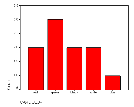
Barchart: >>>
Box-plot: >>>
Correlation: >>>
Data types: >>>
Decimals, Fractions and Percentages >>>
Dependent and Independent Variables: >>>
Descriptive Statistics: >>>
Explanatory and Response Variables: >>>
Histogram: >>>
Hypothesis: >>>
Hypothesis testing: >>> Inferential Statistics:
>>> Interquartile Range: >>>
Mean (Arithmetic mean): >>>
Mean (Geometric mean): >>>
Median: >>>
Mode: >>>
Non-parametric Tests: >>>
Normal Distribution: >>>
One-tailed and two-tailed tests:
>>>
Outlier: >>>
Paired Data: >>>
Parametric Tests: >>>
Population: >>>
P-values: >>>
Range: >>>
Sample: >>>
Scatterplots : >>>
Significance: >>>
Significance testing: >>>
Standard Deviation: >>>
Tests (Different types) >>>
Variance: >>>
X and Y axes and co-ordinates: >>>
This does not set out to tell you everything about the topics listed.
Nor does it require you to learn and understand everything in it! It is
hoped that what is included will help you to make sense of the concepts
you are meet in your course. It should also be useful for reference when
you read articles.
You will be directed to read certain parts as you work through the
course. You will probably want to read, do an activity, and then read again
with more understanding. It would be useful to skim through it all before
you start, to get an idea of what you already know and what you are hoping
to understand better by the end of this course.
Navigation: Use <<< to get back to the top of the document.
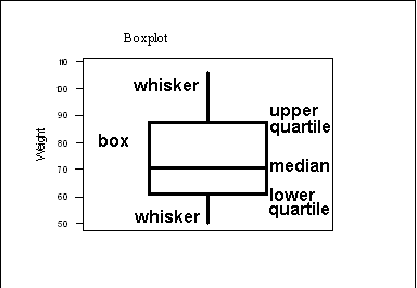
A Boxplot divides the data into quarters. The middle line shows the
median (the value that divides the data in half), the box shows the range
of the two middle quarters, and the whiskers show the range of the rest
of the data. The values at the ends of the box are called the quartiles,
(SPSS refers to these as the 25th and 75th percentiles)
The distance between them is called the interquartile range (IQR).
The more sophisticated version (which SPSS uses) marks outliers with
circles, counting anything more than one and a half times the interquartile
range away from the quartiles as an outlier, those over three times the
interquartile range away from the quartiles are called extremes and marked
with asterisks. The length of the box is equal to the interquartile range
(IQR).
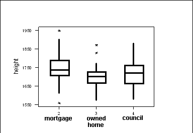
Boxplots are most often used for comparing two or more sets of data.
They allow you to compare level (the median), spread (the interquartile
range) at a glance, as well as showing the minimum and maximum.
The graph on the left compares the heights of men with different kinds
of housing. You can see at a glance that the men who own their own houses
tend to be smaller, and that there is less variation among them than among
those with mortgages or in council housing. You can also see that the tallest
and the smallest subjects both have mortgages.
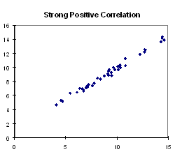
A measure of the relationship between two paired sets of data. This
can be seen by eye from a scattergram.
Strong positive correlation: The points cluster about
a line that slopes upwards from bottom left to top right. Large values
of one variable tend to be associated with large values of the other. Example:
Height and shoe-size exhibit a high positive correlation. Tall people tend
to wear large shoes and small people tend to wear small shoes.
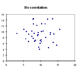
No Correlation:The points are spread out in a way that
doesnt seem to slope up or down from left to right. Example: The number
of visits to a doctor in the last six months is unlikely to be correlated
with shoe-size. People with small shoes do not tend to visit the doctor
more or less than people with large shoes.
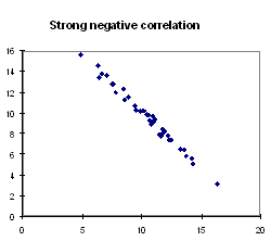
Strong negative correlation: The points cluster about
a line that slopes downward from left to right. Large values of one variable
tend to be associated with small values of the other. Example: Percentage
of patients on waiting list treated in less than 6 months and percentage
of patients on waiting list treated after more than 6 months. Regions where
the first is small the second will be large and vice-versa.
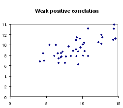
Weak positive or negative correlation: A definite slope
can be seen in the pattern of the points, but they are not so close to
the line, making a shape more like an ellipse.
Non-linear correlation: The points cluster about a curve,
not a line.
The correlation coefficient (Pearsons product-moment correlation coefficient)
is a way of assigning a number to these situations. It is 1 for perfect
positive correlation (all the points exactly on a line sloping up from
bottom left to top right), 0 for no correlation and -1 for perfect negative
correlation (all the points exactly on a line sloping down from top left
to bottom right). It takes in-between values for in-between situations.
It should be noted that a high correlation coefficient on a small sample may
not indicate real correlation in the background population, and that a fairly
low correlation coefficient on a large sample may still indicate background
correlation.
It is also important not to confuse Pearson's correlation coefficient (sometimes
known as r) and the p-value that may be obtained when you test for the significance
of the correlation.
There is another correlation coefficient, known as Spearmans correlation
coefficient. It is similar to Pearsons but calculated slightly differently,
and less affected by extreme values. It is used in tests for correlation
in circumstances where Pearsons cannot be used.
Nominal Data: These are data which give classes which
have no real connection with numbers and cant be ordered meaningfully.
Examples: Male or female, Town of residence.
Ordinal Data: These are data that can be put in an order,
but dont have a numerical meaning beyond the order. So for instance, a
distance of 2 between two numbers would not be meaningfully equivalent
to a distance of 2 between two others.
Level of pain felt in joint rated on a scale from 0 (comfortable)
to 10 (extremely painful).
Social class coded by number.
Interval Data: These are numerical data where the distances
between numbers have meaning, but the zero has no real meaning. With interval
data it is not meaningful to say than one measurement is twice another,
and might not still be true if the units were changed.
Examples: Temperature (Centigrade), Year, adult shoe size (In all
examples the zero point has been chosen conventionally, as the freezing
point of water or the year of Christs birth, or to make 1 smallest size
of shoes adults were expected to wear.
If my shoe size is twice yours in British sizes, this will not also be
true in Continental sizes.
Ratio Data: These are data that are numerical data where
the distances between data and the zero point have real meaning. With such
data it is meaningful to say that one value is twice as much as another,
and this would still be true if the units were changed.
Examples: Heights, Weights, Salaries, Ages.
Note that if someone is twice as tall as someone else in inches, this
will still be true in centimetres.
Percentage Data: Data expressed as percentages.
Example: Percentage of patients on waiting list operated on within
5 months.Decimals,
Fractions and Percentages<<<
It is useful to be able to convert between these. If you are not happy
with converting between fractions, decimals and percentages it is worth
reminding yourself of the following and working out a few for yourself,
so you dont panic if you meet something in an unfamiliar form.
Percentages to decimals: divide by 100. e.g. 7% = 0.07
or 50% = 0.5
Decimals to percentages: multiply by 100. e.g. 0.003 = 0.3%
or 0.25 = 25%
Fractions to decimals: divide the top by the bottom. e.g.
3/8 = 3 ¸ 8 = 0.375
Decimals to fractions: Put the decimal places over 10, 100, or
1000 etc. depending on how many there are. e.g. 0.3 = 3/10, 0.04 = 4/100,
0.007= 7/1000. You can then often simplify these by dividing the top
and the bottom by a common factor, or using a calculator that does this
for you: e.g. 4/100 =1/25.
Percentages to Fractions: If it is a simple whole number put
100 underneath it and simplify if necessary. Otherwise turn it into a decimal
first.
e.g. 5% = 5/100 = 1/20, 3.7% = 0.037 = 37/1000
Fractions to Percentages: If theres 100 on the bottom, leave
it off. Otherwise turn it into a decimal first. e.g. 3/100 = 3%, 7/200
= 7 ¸ 200 = 0.035 = 3.5%
A general term for ways of describing a sample without attempting to
draw conclusions about the background population. The mean, median, standard
deviation and inter-quartile range are examples of descriptive statistics,
as are graphs.
In a situation where we have a hypothesis that changes in one variable
explain changes in another, we call the first the explanatory variable
and the second the response variable (because it responds to changes in
the first). A scattergram should always have the explanatory variable on
the x-axis and the response variable on the y-axis.
Example: the hypothesis is that your heart rate increases the longer
you exercise. You control the time of exercise by taking measurements of
heart rate after 0, 5, 10, 15 minutes etc. Time is the explanatory variable
and heart rate is the response variable.
A hypothesis that changes in one variable explain changes in another is
best tested in a situation where the explanatory variable can be controlled,
as in the above example.
In medical statistics, situations where one variable is controlled can
be difficult to set up ethically. (How would patients react in your
discipline if they were told the length of their treatment would be decided
at random as part of an experiment?)
This means we often cannot choose people at random to give different
treatments, but must use the treatments they were given for other reasons.
This may mean that the explanation for the response variable comes not
from the different treatments, but from other different factors that determined
the treatments.
Example: it was argued for a long time that heavy smokers did not
die of lung cancer because they were heavy smokers, but because of other
lifestyle factors which drove them to become heavy smokers.
There are many situations where variables are correlated but neither is
explanatory.
Example: Areas where more households have two cars also report
less deaths from lung cancer. Both variables are at least partly explained
by the variable money.
In situations where the explanatory variable is controlled experimentally
it is often known as the independent variable, and the response variable
as the dependent variable (as you can decide independently what
the independent one will be, and the other depends on it).
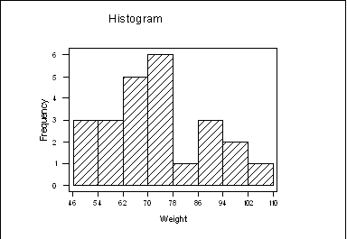
A kind of barchart where each bar represents the frequency of a group
of data between certain values. The bars touch each other and the x-axis
has a continuous scale. (Not the case in other types of bar chart, where
the data does not need to be continuous.)
Histograms are usually used to examine the distribution of data: whether they
are evenly spread out along the range, or bunched together more at some points.
In particular, a histogram is one way of checking whether data are roughly normally
distributed.
A statement that your research is trying to support or reject. Examples: Heartbeat
increases after exercise, heartbeat stays the same after exercise, tall people
have longer legs, height has no effect on leg length, learning relaxation techniques
helps lower anxiety, learning relaxation techniques has no effect on anxiety.
In the context of formal hypothesis testing, your hypothesis is known as the
alternative hypothesis, and is opposed to the null hypothesis. The null hypothesis
is usually the status quo: what would be believed anyway without your research.
This is the formal process of deciding between a null hypothesis and an alternative
hypothesis by finding a measure (the p-value) of the probability that results
similar to those obtained could have been obtained by chance if the null hypothesis
were true.
If this probability is below a pre-determined significance level (usually 0.05,
0.01 or 0.001) the alternative hypothesis is accepted.
The null hypothesis usually corresponds to the status quo: what most people
would believe unless presented with good evidence. The alternative hypothesis
is the hypothesis that the research is hoping to support.
Example: A researcher collects data on reported anxiety levels of a group
of people before and after learning relaxation techniques. The null hypothesis
is that the relaxation techniques make no difference. The alternative hypothesis
is that learning the relaxation techniques does lower reported anxiety levels.
The researcher discovers from looking at her data that anxiety levels in her
sample do appear lower after learning relaxation techniques. But she is not
sure whether this is just a chance effect. The hypothesis test is a series of
calculations which give the probability that she could have got results showing
anxiety levels that much lower by chance if the null hypothesis were really
true. The calculated probability is called the p-value. The researcher has decided
in advance to accept her alternative hypothesis if the p-value is below 0.05.
This is known as the significance level of the test.
It is important that the alternative hypothesis is decided before the data
are collected. The researcher must decide whether she is testing that one set
of data will be larger, smaller or different from another. If she simply suspects
that there will be a difference, without predicting which way, she must test
for a difference and not decide to test for a particular direction of difference
after she has seen the data.
It is also important that you realise that a set of data may allow you to ask
several different questions and carry out several different tests on different
hypotheses. The hypothesis test is a test on the hypotheses, not on the data.
It does not make sense to say that 'these data give a p-value of 0.05' unless
the hypotheses have been clearly stated. Inferential Statistics: The attempt
to draw conclusions about the background population from sample data. Most work
in statistics has this as its eventual aim. This can be done informally: 'from
the figures it appears likely that the treatment makes people better'. The formal
method involves hypothesis testing and ideas of probability, to find the likelihood
that a result could have been obtained by chance if the null hypothesis were
true.
The attempt to draw conclusions about the background population from sample
data. Most work in statistics has this as its eventual aim. This can be done
informally: 'from the figures it appears likely that the treatment makes people
better'. The formal method involves hypothesis testing and ideas of probability,
to find the likelihood that a result could have been obtained by chance if the
null hypothesis were true.
A measure of spread or variability, similar to the standard deviation.
It
is most often used to compare the variability of different samples.
It is the difference between the lower quartile and the upper quartile.
These are the values that a quarter of the data lies below, and that three
quarters of the data lie below, so the inter-quartile range is the range
of the middle half of the data.
Example: A group of 12 patients has ages 18, 18, 19, 19, 19, 20,
21, 23, 30, 33, 45, 81. The lower quartile is 19 and the upper quartile
is 31.5. The interquartile range is 12.5. (31.5 - 19 = 12.5)
Another group of 12 patients has ages 18, 19, 19, 19, 19, 19, 20,
21, 21, 22, 22, 85. The lower quartile is 19 and the upper quartile is
21.5. The interquartile range is 2.5. The first group has more variability
in age.
Box-plots show the quartiles.
SPSS will calculate the quartiles and the inter-quartile range can be
calculated easily from these by subtracting the lower quartile from the
upper one.
(There is some disagreement in different books about the exact method
of calculating quartiles - all different methods come out pretty close
and we are not concerned here with the details.)
A measure of level or central tendency, the mean gives a number somewhere
in the middle of your data set. The Mean is often referred to as the average,
but this can cause confusion as the Median and the Mode are also kinds
of averages.
The mean is calculated by adding up all the data and dividing by how
many there are. SPSS will do this for you on the computer. Most scientific
calculators will also give you means directly.
Example: A sample of 5 patients have ages 18, 23, 20, 18, 81. The
mean is (18+23+20+18+81) ¸ 5 = 32. Note
that this mean is considerably larger than 4 of the ages in the set. If
the 81 had in fact been mistyped for 18 your result would be seriously
affected by this.
The mean has the advantage over the median that it takes into account all
the data, and the disadvantage that very large or very small values can
have a distorting effect on it.
Another measure of level or central tendency but much more difficult
to calculate than the Arithmetic mean! Rather than adding the numbers together
and dividing by the number of numbers, the numbers are multiplied together
and for "N" numbers the Nth route of the result is taken. When
people refer to the mean they usually mean the Arithmetic mean, so dont
worry about the geometric mean. I Include it here mainly for completeness.
Another measure of level or central tendency. The median is found by
ranking the data set in order and taking the middle one (or the mean of
the two middle ones if there are two).
Example: A sample of 5 patients have ages 18, 23, 20, 18, 81. In
order this is 18, 18, 20, 23, 81. The median is 20, the middle value. If
a patients age lies below the median they are in the bottom half of the
set, and if above the median they are in the top half.
The median has the advantage over the mean that it is often easier to see
by eye for very small data sets, and is not unduly affected by extreme
values. It can be calculated on SPSS and some calculators. It is useful
when you want to know whether a particular result lies in the top or bottom
half of a data set.
Box-plots show the median.
In a symmetrical distribution, the mean and the median will be close. Differences
between the mean and median indicate asymmetry.
The most frequent data value. It is often the easiest to pick out by
eye.
Example: A sample of 5 patients have ages 18, 23, 20, 18, 81. The
mode is 18, since this age occurs most often.
In a roughly normal distribution the mode will be close to the mean and
the median.
It is possible for a data set to have several modes. The presence of several
modes in a large dataset can indicate that different populations have been combined.
Tests that do not depend on many assumptions about the underlying
distribution of the data. They are used widely to test small samples of ordinal
data.
On this course we deal with the Wilcoxon signed rank test,
and the Mann-Whitney test. You may later encounter Spearman's rank correlation
coefficient, the Kruskal-Wallis test and many others.
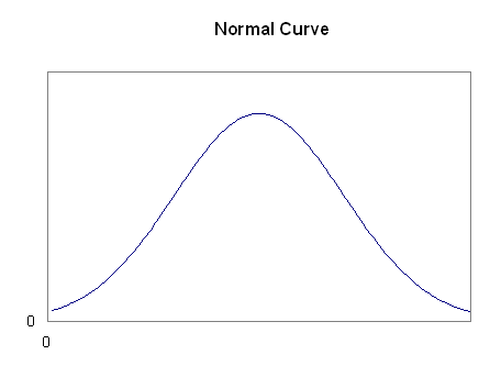
The name of a specific distribution with a lot of data values near the
mean, and gradually less further away, symmetrically on both sides. A lot
of biological data fit this pattern closely.
The histogram for a large number of normal data has a bell-shaped curve.
Some parametric tests depend on data coming from roughly normal
populations. This is less important with large samples, as statisticians have
shown that the means of large samples have a roughly normal distribution, whatever
the distribution of the background population.
A data value, which is very big or very small, compared with the others.
Sometimes these are due to mistakes in entering the data and should always
be checked.
Outliers which are not mistakes can occur. It is worth examining your
data carefully and trying to explain why certain items stand out.
There are different rules for deciding exactly what to count as an outlier.
In SPSS a circle on a boxplot is used to mark outliers with values between
1.5 and 3 box lengths from the upper or lower edge of the box. (The box
length is the interquartile range.)
In SPSS an asterisk on a boxplot represents an extreme outlier (just
called an extreme in SPSS documentation but I feel the term extreme outlier
is more helpful) which is a value more than 3 times the interquartile range
from a quartile.
Data are paired if the entries in each row are connected with each other.
Examples:
Paired:
the ages and weights of a group of gymnasts
the weights of a group of gymnasts before and after a training session
Non-paired:
the weights of a group of gymnasts and a group of non-gymnasts
the changes in weight of two groups of gymnasts given different kinds
of training session
If you are not sure whether two columns of data are paired or not, consider
whether rearranging the order of one of the columns would affect your data.
If it would, they are paired.
Paired data often occur in before and after situations. They are also
known as related samples. Non-paired data can also be referred to as
independent samples.
Scatterplots (also called scattergrams) are only meaningful for paired data.
Tests that depend on an assumption about the distribution of
the underlying population data. t-tests are parametric because they assume that
the data being tested come from normal populations. Tests for the significance
of correlation involving Pearson's product moment correlation coefficient involve
similar assumptions.
When the sample is large, parametric tests can often be used
even if the assumptions cannot be made, because the means of large samples from
any distribution are roughly normally distributed.
Pie charts, are used to show proportion, e.g. the number of
votes cast for each party in an election. The pie should add up to 100% of the
observed data. The size of each slice is proportional the percentage of the
data it represents.
The background group that we are using the sample to find out
about.
Example: A group of 20 patients with anxiety problems
are used to draw conclusions about how any patients with anxiety problems
would respond to treatment. The population could be: patients in Sheffield
with similar problems, patients in England, patients all over the world,
patients from similar ethnic groups etc.
Conclusions may be more or less valid depending on how wide
the population they are supposed to apply to is, and how representative of that
population the sample is. Strictly, a sample should be drawn at random from
its population for the results of tests to be valid.
These measure the statistical significance of a result. The
lower the p-value the more significant the result.
The p-value is the probability of the result arising by chance,
if the null hypothesis were true, instead of the alternative hypothesis which
is the one the research is trying to support. So if this value is low, the results
are unlikely to be due to chance and there is good evidence in favour of the
alternative hypothesis.
It often helps to understand the meaning of a p-value to make
a sentence stating how many times out of 100 ( or a 1000...) a similar result
could have been obtained by chance if the null hypothesis were true.
Example: A suitable test is used to find whether the
questionnaire scores for anxiety of a group of patients are lower after
a course of therapy than before. The test gives a p-value of 0.05. This
means that 5 times out of 100 (or 1 time out of 20) a test like this would
have obtained a result as significant by chance, if the therapy had no effect.
There is a convention that p-values below 0.05 are called significant,
p-values below 0.01 are called highly significant, and p-values below 0.001
are called very highly significant. They are often marked *, **, and *** respectively
in tables of results.
It is important to note that a high p-value does not mean that
the alternative hypothesis is false, but only that your data do not provide
good evidence for it.
Example: A suitable test is used to test whether patients
over 50 report back pain more often than patients under 30. With a sample
of 5 patients of each kind a p-value of 0.10 is obtained, which is not statistically
significant so does not support the hypothesis. However it does not show
that the hypothesis is wrong! More data is then collected and the test is
applied to a larger sample of 30 patients of each kind. A p-value of 0.003
is obtained, which is statistically significant and does support the hypothesis.
If the alternative hypothesis is really true, large samples
are more likely to give statistically significant results than small ones.
It is also important to note that a low p-value does not prove
that your results are not due to chance, but only that they are unlikely to
be due to chance. (It is worth noting that if you keep re-sampling and applying
tests to samples from a large population you are likely, eventualy, to get at
least one result significant at 0.05 result even if none of the alternative
hypotheses are true.)
Note that SPSS often only gives p-values to 3 decimal places,
so any p-value less than 0.0005 will appear as 0.000. This is an extremely significant
result, and in such a case you can be very sure of your alternative hypothesis.
(But note that statistical methods never deliver complete certainty, and avoid
words such as 'certain' or 'proved' in writing about the results of hypothesis
tests.)
The p-value is only meaningful if you state clearly the hypotheses
that it relates to.
An example from outside medicine may help to clarify
the meaning of the p-value. One of your friends is extremely late for a
very important appointment with you. He tells you that all three of the
buses he had to catch were running an hour late. You know that the buses
normally run every ten minutes and that nothing unusual has affected the
traffic today.
Your null hypothesis, which you would like to believe,
is that your friend is truthful. Your alternative hypothesis, which you
don't want to accept, is that he is lying for some reason.
You think that one bus might run an hour late perhaps
one time in 50. (A p-value of 0.02) This is unlikely to happen, but by no
means unbelievable. You would still choose to believe your friend if only
one bus was involved.
But three! This could only happen one time in 50´
50´ 50 (a p-value of 0.000008). This seems
so very unlikely that you decide, reluctantly, not to trust your friend.
This story illustrates the basics of hypothesis testing.
There is a null hypothesis, usually linked to the status quo: this drug
makes no difference to patients, these two groups of people are not different
from each other, there is no correlation between the incidence of smoking
and the incidence of lung cancer.
There is an alternative hypothesis, which the experiment or data collection
is intending to prove: this drug does make a difference, these groups are
different, areas where people smoke more have higher lung cancer rates.
The p-value shows you the likelihood of getting your data if the null hypothesis
is true. A low p-value makes you less likely to believe the null hypothesis
and so more likely to believe the alternative hypothesis. The lower the p-value,
the stronger your evidence in favour of the alternative hypothesis.
The null and alternative hypothesis are mutually exclusive.
The difference between the smallest and largest value in a data set.
It is a measure of spread or variability, but only depends on the two
extreme values, and does not tell anything about how spread out the rest
are.
It can be distorted by one extreme value.
Example: a group of patients are aged 18, 20, 23, 18, 81. The range
is 63. The 81 year old has a huge effect on this: if it were a mis-typing
for 18 the result would be very distorted.
It is useful as a very quick measure of variability, but the inter-quartile
range or the standard deviation are to be preferred for more precise comparisons
between different data sets.
The group ofpeople, (or things, or places,) that the data have been
collected from. In most situations it is important to pick a representative
sample, which is not biased e.g. mainly women, mainly from particular age
or income bands or with particular educational qualifications. There is
a range of methods for doing this. If a hypothesis test is to be used, a sample
should ideally be drawn randomly from the population it is being used to draw
conclusions about.
Scatterplots
(Also known as x-y plots and Scattergrams): <<<
A graph used to show how paired data are related.
Each point represents a pair of data values, one given by its x co-ordinate
and the other by the y co-ordinate. They are used to look for correlation.
They can also be used to look for increases or decreases after a treatment,
by plotting before and after values and seeing whether most of the points
lie above or below the y = x line.
See the graphs used to illustrate correlation for examples of scattergrams.
A measure of the likelihood of results being due to chance.
The most common levels used are 0.05 (5%), 0.01 (1%) and 0.001 (0.1%). Before
a hypothesis test is carried out, the researcher decides what level of significance
she will take as evidence for her alternative hypothesis. The lower the level
used, the greater the statistical significance of the result.
In statistics significance is a technical term, and is not
equivalent to the ordinary use of the word to mean importance. Something may
be statistically significant, but not important. In medical statistics the phrase
'clinically significant' is used to contrast with 'statistically significant'.
If a difference between two things is statistically significant,
we have evidence that it is not due to chance. If it is clinically significant,
it is a difference which will be important in practice.
Example: A hypothesis test applied to large numbers
of people taking drugs A and B gives evidence that more people improve with
drug A than with drug B. However the difference is between 63% and 62% of
all patients, which clinically is unlikely to affect the choice between
the drugs. The test has shown that a real difference exists, but the difference
is not large enough to be important in practice. The difference is statistically
significant but not clinically significant.
A measure of the spread or variability of a data set.
The larger the standard deviation, the more spread out about the mean
the data are.
Like the mean, the standard deviation takes all values into account
and can be very affected by an extreme value. The Inter Quartile Range
is less effected.
You can find how to calculate it in any standard statistics book but
you do not need to, as SPSS will calculate it for you. Most scientific
calculators will also calculate it from the raw data if you do not have
access to a computer.
Example: Two groups of 5 patients have the following ages: Group
A: 18, 24, 30, 36, 42, Group B: 18, 19, 20, 38, 55, . Both groups have
the same mean, 30. The standard deviations are 8.5 for Group A and 14.5
for Group B, showing the ages in Group B are more spread out from the mean.
When the data come from a normal population or the samples
are large.
Used on two different samples, which are not paired, to test
for differences in the population means.
A one-tailed version is used when the alternative hypothesis
is that the mean of the first population is greater (or less) than the other.
A two-tailed version is used when the alternative hypothesis is that the means
differ, but it doesn't specify which way.
The equivalent of the two-sample t-test, used when the sample
is small, and you cannot assume the data come from a normal population (particularly
for ordinal data). It tests for differences in the population medians.
When the data come from a normal population, or the samples
are large.
Used on paired data, to see if the differences in the samples
imply significant differences in the background populations.
The test is applied to a column made up of the differences,
and the test tests whether this column has a mean significantly different from
zero.
A one-tailed version is used when the alternative hypothesis
is that the mean of the differences is greater (or less) than zero. A two-tailed
version is used when the alternative hypothesis is simply that it is not zero.
The test can also be used for any single sample to test whether
its mean is significantly different from any chosen value.
The equivalent of the one-sample t-test, used when the samples
are small, and you cannot assume the data come from in a normal population (particularly
for ordinal data). It tests whether the median of the differences is different
from zero in a similar way.
As with the one sample t-test it can also be used to test whether
the median of one sample is significantly different from any chosen value.
This can be used to test for statistically significant correlation
when the data come from normal populations or the sample is large.
Note that the correlation coefficient is not the same thing
as the p-value. The correlation coefficient indicates the strength of the relationship,
while the p-value indicates if there is a statistically significant relationship.
Used similarly to Pearson's when you cannot assume the data
come from normal populations and the sample is small.
ANOVA
This term refers to a procedure entitled Analysis Of Variance.
It is a statistical technique for testing for differences in the means of several
groups, typically three or more. It tells us if there are significant differences
between any of the samples. E.g. if patients selected at random from a population
were treated in three different ways, ANOVA could tell us if there is a significant
difference between any of the samples. Rejecting the ANOVA null hypothesis suggests
that population means differ, but does not tell us where such differences lie.
You are left unsure whether all the means differ or if there is one "odd
one out."
Chi-square ( c
² )
The Chi-square statistic (pronounced Ky-square Sky without
the S) is a form of enumeration statistic. Rather than measuring the value
of each of a set of data, a calculated value of Chi Square compares the frequencies
in various categories in a random sample to the frequencies that are expected
if the population frequencies are as hypothesised by the researcher.
It is used a lot in statistical calculations, but you wont need it
to use and interpret statistics. The standard deviation is the square root
of the Variance.
The x-axis is the horizontal line along the bottom of a graph and the
y-axis is the vertical line up the side, (except where negative values
are involved, when the axes will be in the middle of the graph). Any point
on a graph has an x co-ordinate, which is the number on the x-axis level
with it, and a y co-ordinate, which is the number on the y-axis level with
it.
The point where both co-ordinates are zero is called the origin.
The diagonal line which goes through all the points whose x and y co-ordinates
are the same is called the line y = x.